GINGA
A long form generative artwork collaboration.

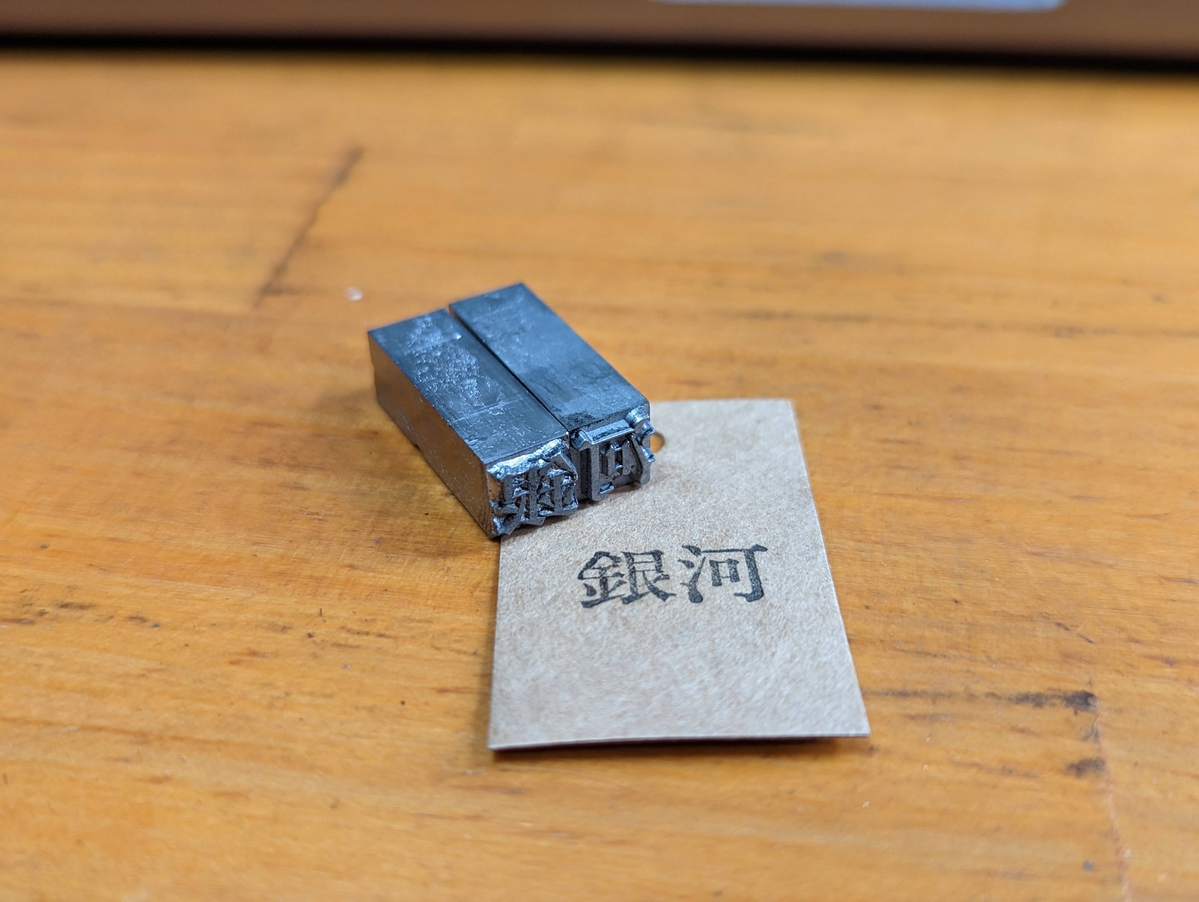
This article details the making of our collaborative generative art piece, titled 'GINGA - 銀河', created in partnership with the Japanese artist A-Mashiro. Our collaboration began approximately six months ago, despite significant differences between our respective art forms. A-Mashiro's work is hand-created and features simple, clean geometry, while my art is code-generated and boasts sophisticated textures.
Despite these divergences, we both have a great appreciation for one another's work. When A-Mashiro initially approached me about this project, I was thrilled at the opportunity, albeit somewhat nervous about how our artistic practices would mesh. Nevertheless, we are both exceedingly enthusiastic about the project and eager to experiment, learn from one another, and push our creative boundaries.
Early Experiments
To begin with, I sought to emulate A-Mashiro's style by incorporating simple geometric shapes that overlap one another. However, I added a unique twist by rendering these shapes in 3D. A-Mashiro's art possesses a pronounced sense of rhythm and flow, which I particularly admire. My aim was to capture and replicate this fluidity by employing algorithms in my work.
Here is a timelapse video of the early experiments :
Conflicts and Collisions
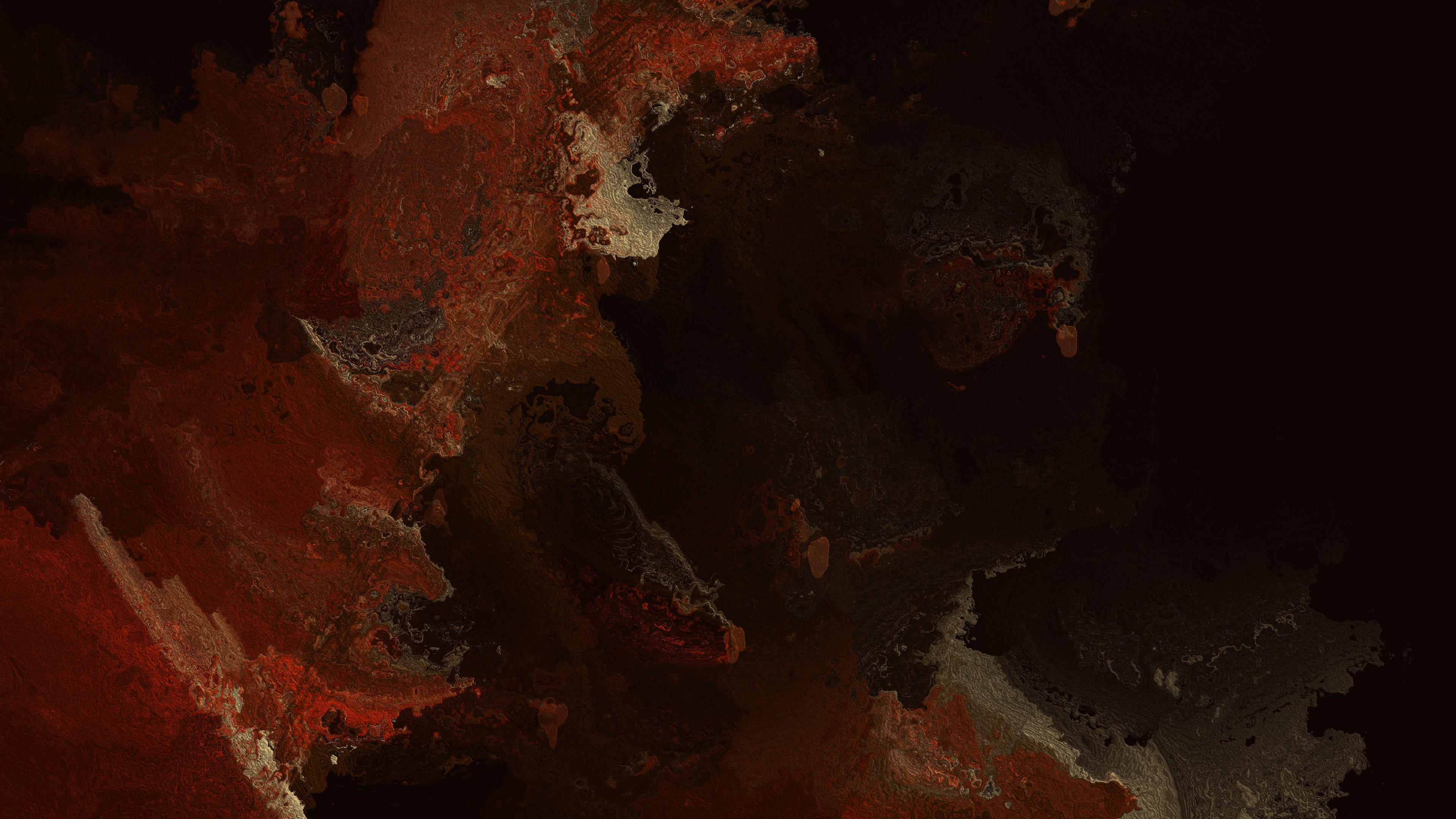
Simultaneously, I also began exploring different options for the background. My initial concept involved expanding upon my previous piece : 'The Fire Within' to create a mural-like effect:
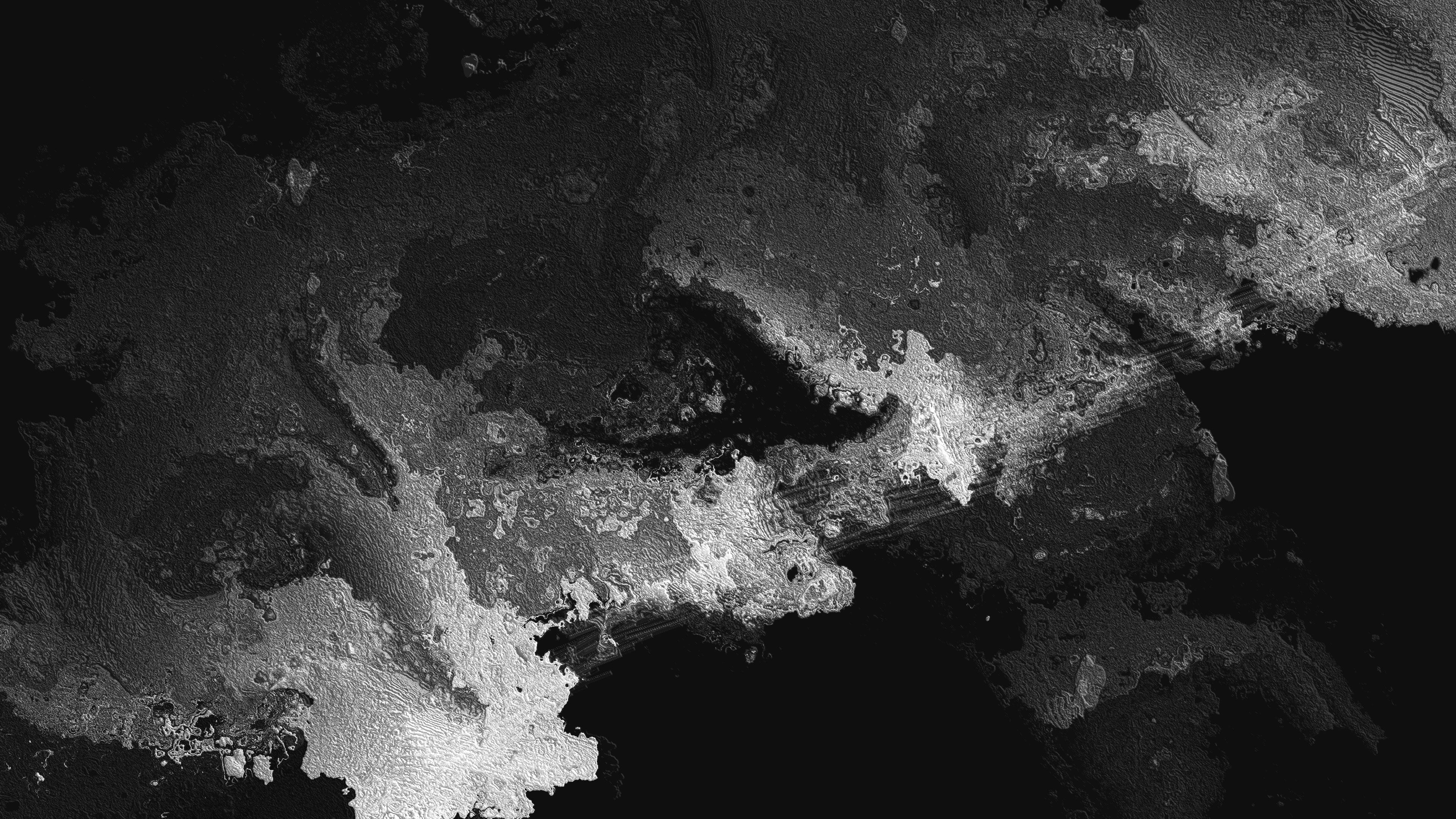
I found this concept to be quite compelling and began brainstorming ways to connect the geometric shapes with the background. It occurred to me that if I could create a sense of flow within the composition of the shapes, I could use that as a guide for how the background colour should flow. Additionally, I wanted to incorporate two layers with opposing flows to create a sense of conflict and stretching:
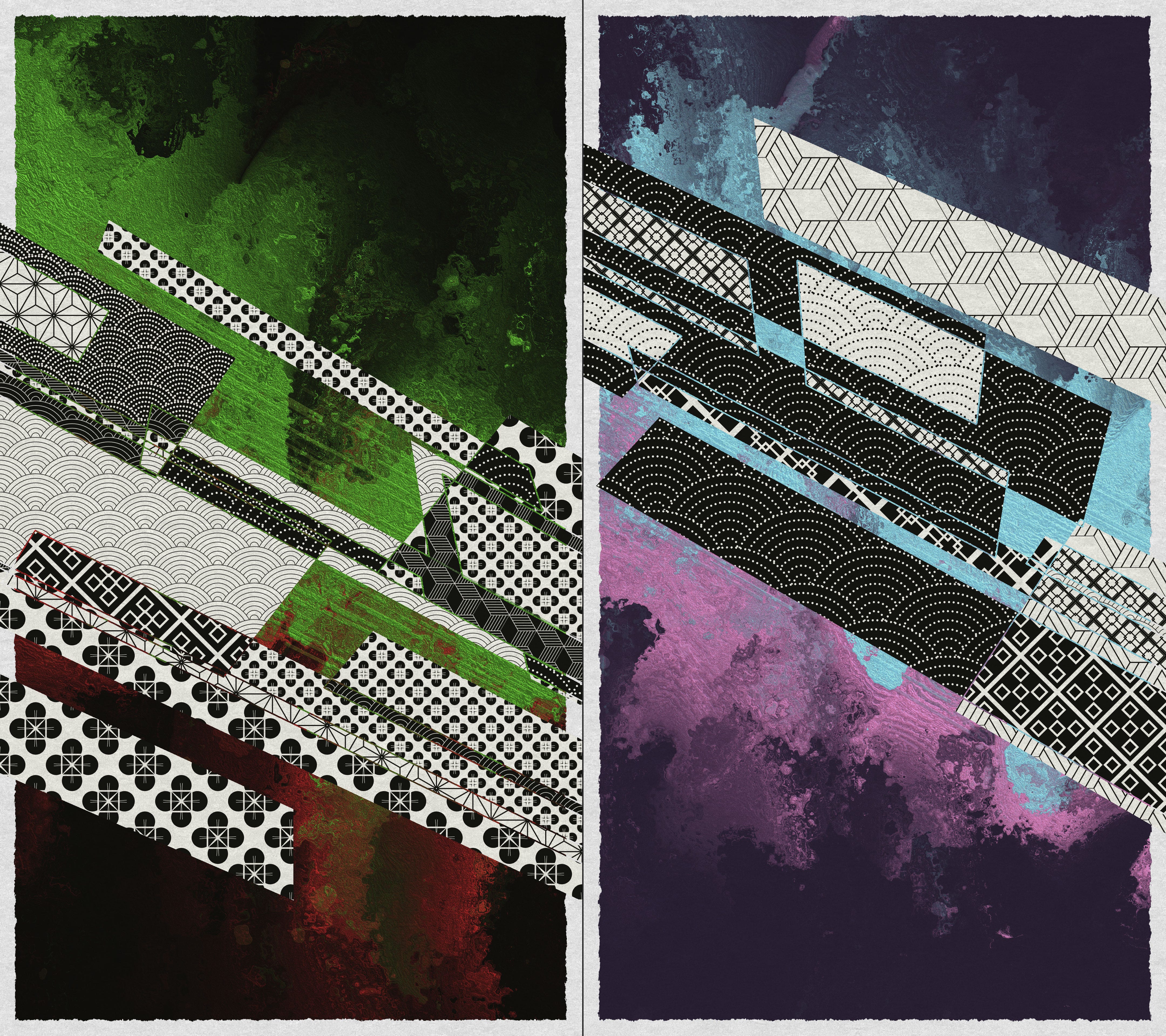
I found the resulting background, with its colliding elements, to be particularly poignant as it served as a visual representation of our collaboration. Although our backgrounds were vastly different, they worked together seamlessly.
Manga
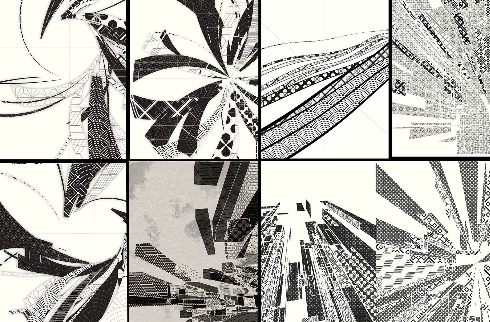
As we worked on the background, A-Mashiro and I discovered a shared love of manga. This reminded me of the screentone effect frequently utilised in manga, which sparked an idea to incorporate it into our background:
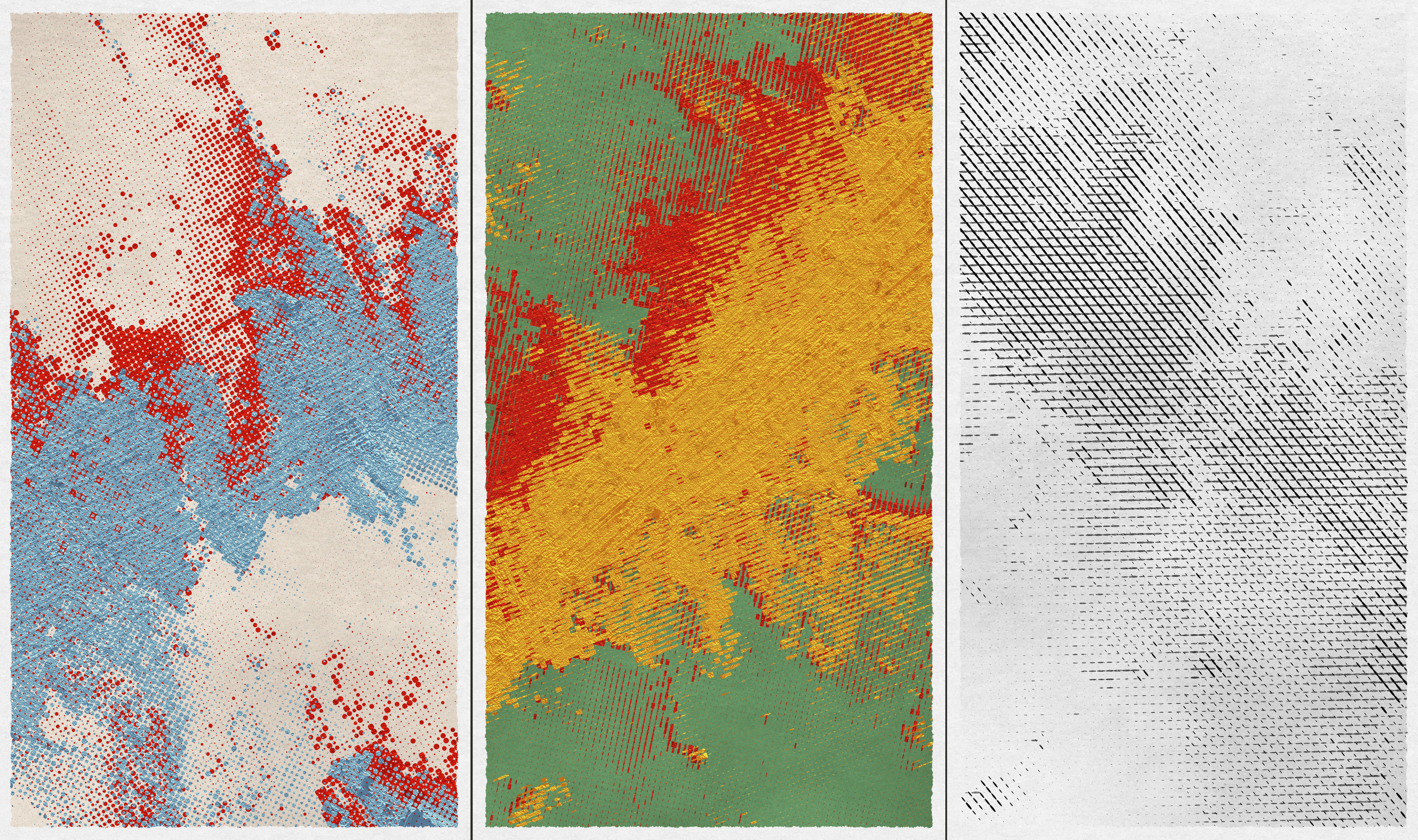
Together, we designed three distinct screentones: dots, dashes, and crosses. We were both thrilled with the variations and ultimately settled on these designs for our final background.
Colour
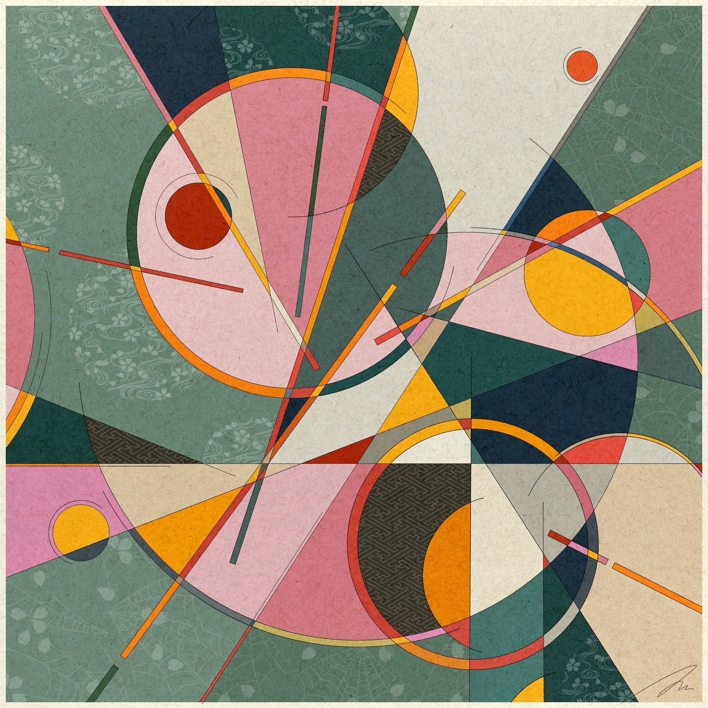
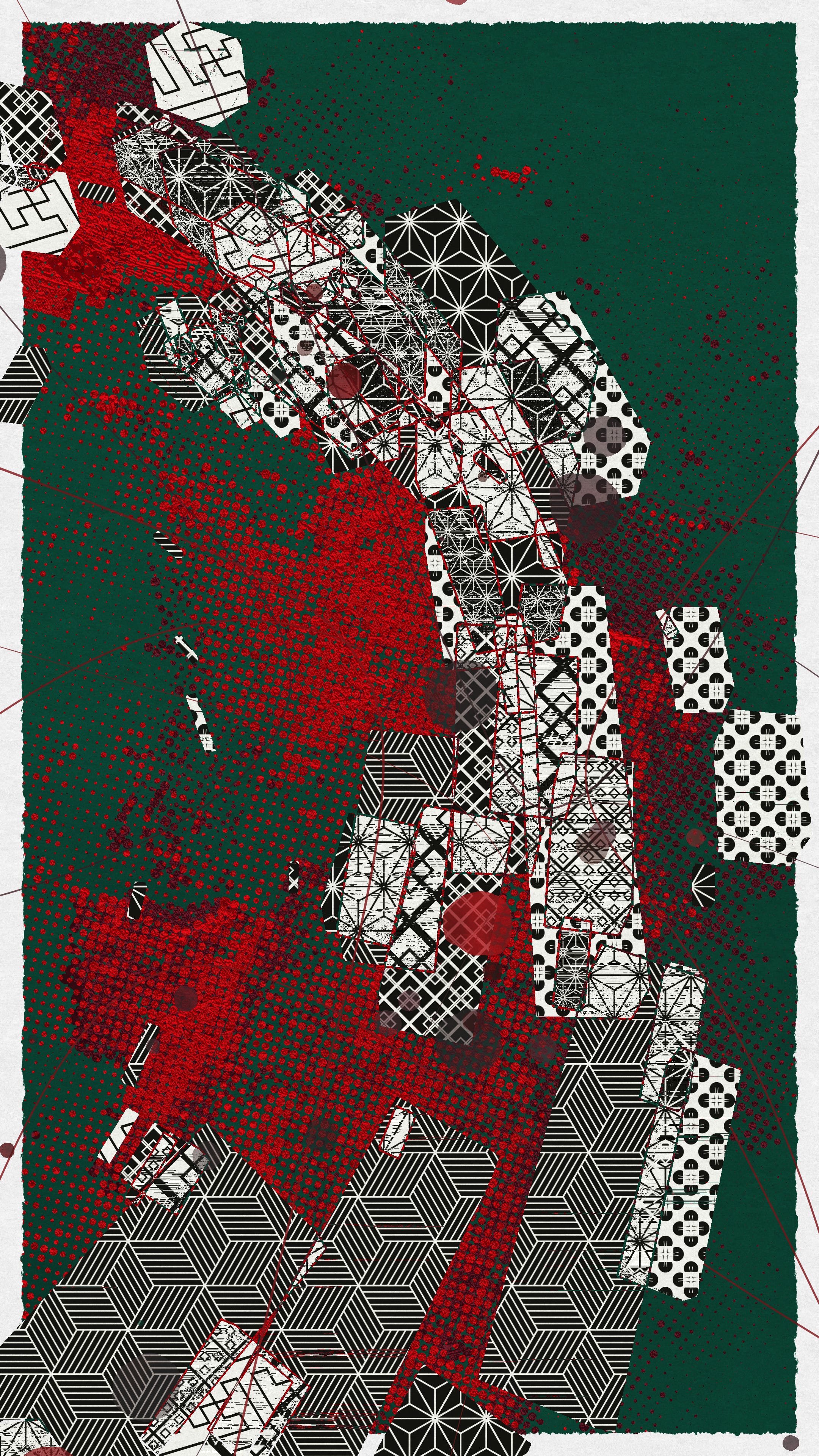
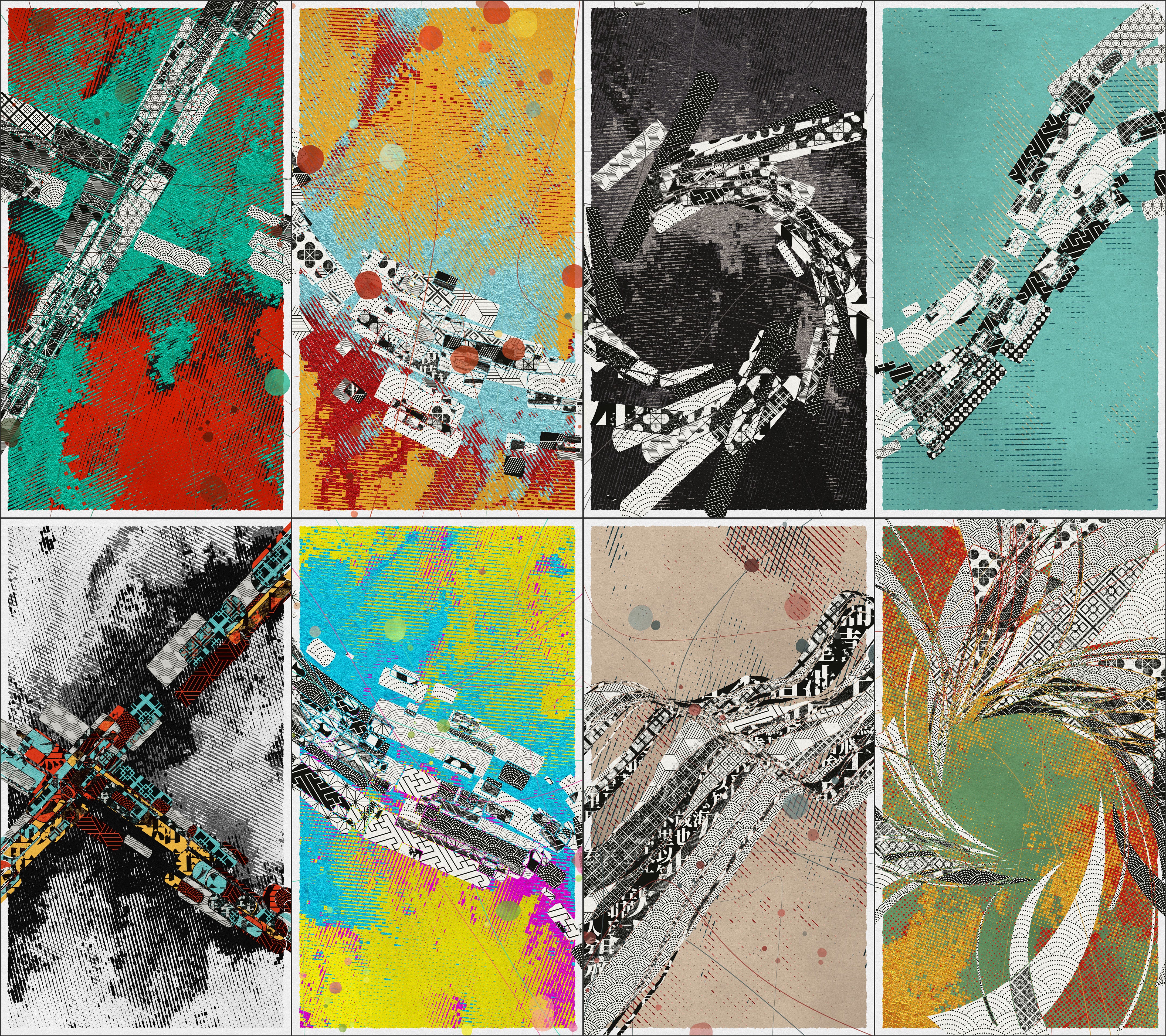
Initially, I experimented solely with monochromatic colour schemes. My original plan was to allow A-Mashiro to handle the colour selection, as his iconic use of colour greatly appealed to me. I aimed to create a tool that would enable him to choose the colour. However, as the project progressed, I continued to work with the monochromatic background. We noticed that the contrast between the coloured background and the black and white geometries created a visually striking effect. This played into the underlying concept of our collaboration: despite our differing backgrounds, we were able to coexist and collaborate in the same space. As a result, we decided to maintain the geometries in black and white and apply colour exclusively to the background for the majority of the project.
Building tools, not project
From the project's inception, I knew that as a collaborative effort with A-Mashiro, who lacks a background in coding, I wanted to create a tool that he could use to contribute to the project. Throughout development, I added various controls to the tool, allowing A-Mashiro to examine and tweak values, and provide me with feedback. This process was successful and allowed him to be directly involved in the project's creation, rather than merely conceptualising. I believe it's crucial for A-Mashiro to have the ability to 'play' with the project and incorporate his ideas directly, rather than having to communicate them to me for implementation. Here's a demonstration of how our colour theme selection tool works:
Collaboration
This collaboration has been an incredible journey for me, filled with valuable experiences and a lot of fun. Our distinct backgrounds have led to different ways of thinking, which have inspired me greatly. That's why I'm particularly pleased with the result of this project. You can see many "conflicts" in the work, such as the contrasting colours between the two layers of the background or the contrast between the coloured background and the black and white geometries. Additionally, there is the contrast between the simple geometries and the detailed textured background. Despite these conflicts, everything coexists in a harmonious way, which is truly remarkable.
It is a great pleasure to share this journey and the result with the world. And hope you enjoy it as much as we do !